
CMYK vs Pantone: Which Printing Method Should You Use for Packaging?
Process colour and spot colour do different jobs. What CMYK and Pantone actually are, when each one is right, and why the board and the finish change the colour you end up with.

Two jobs leave the same press on the same day. One is printed CMYK, one carries a Pantone spot ink. On screen the artwork looked identical. Off press, one brand colour is exactly where the brand guidelines say it should be, and the other is close.
Understanding why is the difference between specifying print with confidence and hoping for the best. This guide explains what the two methods are, when each is appropriate, and what to send us so the result matches what you had in mind.
What CMYK is
CMYK — cyan, magenta, yellow and black — is process printing. Every colour is built by laying down tiny dots of those four inks in varying densities. Stand back and the eye blends them into a continuous image.
Its strength is range. Four inks reproduce photographs, gradients, illustration and any number of colours at no extra cost per colour, because the same four inks make all of them. Almost all packaging with photographic content is printed this way.
Its weakness is precision on a single flat colour. A specific corporate blue built from four overlapping dot patterns depends on each of those four laying down exactly as intended. Small, normal variations in ink density move the result slightly.
What Pantone spot colour is
A Pantone spot colour is not built from other inks. It is mixed to a formula before it reaches the press and printed as one solid ink. Specify Pantone 288 C and the ink is mixed to be Pantone 288 C.
That is why spot colour is the answer when a brand colour has to be right rather than nearly right. It also produces cleaner, denser flat areas than process can, and reaches colours process cannot: metallics and fluorescents are not mixable from CMYK at all.
The trade-off is that each spot colour is a separate ink. Spot printing suits designs built on one, two or three flat colours. It does not suit photography.
Process and spot compared
| CMYK process | Pantone spot | |
|---|---|---|
| How colour is made | Four inks overprinted as dots | One pre-mixed ink, printed solid |
| Photographic artwork | Yes — this is what it is for | No |
| Exact brand colour | Close, with normal variation | Matched to a standard |
| Flat solid areas | Can show dot structure | Dense and even |
| Metallic or fluorescent | Not achievable | Available as special inks |
| Cost behaviour | Colour count does not change it | Each additional ink adds setup |
| Typical use | Imagery, illustration, full-colour retail | Logos, one- and two-colour identities |
Why the screen and the print differ
A monitor emits light and mixes red, green and blue. Print reflects light and mixes inks on a surface. The two do not have the same range, and some colours a screen shows easily — intense oranges and greens especially — sit outside what four process inks can reach.
A monitor is also a variable. Two uncalibrated screens in the same room disagree with each other, so “it looked different on my laptop” is usually true and rarely useful. The reliable references are a Pantone book viewed in ordinary daylight, and a physical sample printed on your actual board.
When CMYK is the right choice
- The artwork contains photographs, gradients or illustration.
- The design uses many colours.
- Brand colours are a guide rather than a strict standard.
- The pack is one of a range of variants and the palette changes between them.
For most retail folding cartons and most food packaging, CMYK is straightforwardly correct.
When Pantone is worth it
- A brand colour must be consistent across every pack and every reprint.
- The design is one or two flat colours — common on rigid boxes and paper bags.
- You need a metallic or fluorescent that process cannot produce.
- Large flat areas must be perfectly even.
Using both together
This is more common than either alone. Process handles the photography and general artwork; one spot ink carries the logo so the brand colour is exact. A pack might be printed CMYK plus one Pantone, then foil stamped — three different ways of putting colour on board, each doing what it is best at.
What the board does to the colour
The same ink prints differently on different surfaces, and this surprises people more than anything else in the process.
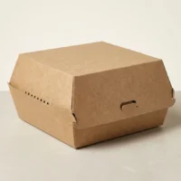
Coated board holds ink on the surface, so colours stay bright and detail stays sharp. Uncoated and kraft boards absorb ink, so the same colour prints softer, slightly darker and less saturated. On a brown kraft surface everything shifts warm, because the ink is not sitting on white — pale colours can nearly disappear.
This is not a fault to be corrected. It is why a sample on the actual board is worth more than any amount of on-screen approval. Our prototyping and sampling service exists for this decision.
Finishing changes it too
Lamination is not optically neutral. Matte lamination slightly mutes and softens colour. Gloss deepens it and increases contrast. Soft-touch mutes it further and adds a texture that changes how the surface reads under light. Spot UV does not change the ink beneath it but creates a contrast that makes adjacent areas look different.
If colour is critical, decide the finish before approving the colour, not after. Our finishing page covers what is available.
Preparing artwork
Files that print predictably tend to share the same characteristics:
- Vector artwork for logos and type, so edges stay clean at any size.
- Images at adequate resolution for the final printed size.
- Colours specified as CMYK values or named Pantone references — not RGB, which has to be converted, and converts differently depending on how it is done.
- Fonts outlined or supplied.
- Bleed included, and important content kept clear of trim and crease lines.
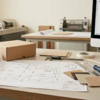
- A cutting profile or dieline as a separate layer, if you have one.
If artwork is not ready in that form, that is ordinary — packaging design covers dieline preparation and press-ready files.
What to tell us
When asking for a quotation, the useful information is:
- Whether any colour must match a specific standard, and its Pantone reference if you have one.
- Whether the artwork contains photographic content.
- Which board or surface you have in mind, or that you would like a recommendation.
- The finish you are considering, since it affects the colour.
- Whether this is a one-off or will be reprinted, which raises the value of consistency.
Where colour accuracy genuinely matters, ask for a sample on the production board before the full run. It is the only check that settles the question.
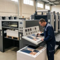
Process and spot printing are both run at our own facility — packaging printing sets out what that covers, and sending your artwork is the quickest way to get a recommendation.